The Mink Harlem Padel Club
What we did
Brand strategy
Visual identity
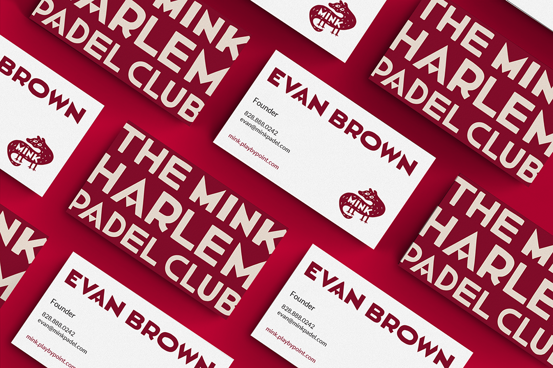
Logo design
Custom typography
Launch campaign
Brand guidelines
Open House New York (OHNY) is a nonprofit organization that promotes unparalleled access to the city—to the places, people, projects, systems, and ideas that define New York and its future.
Since 2001, OHNY has promoted openness as a key civic principle. Through year-round activities, including the annual OHNY Weekend, they provide a citywide platform for education and exploration, fostering discussions about the connection between place and quality of life for all New Yorkers. OHNY’s aims to ensure every New Yorker enjoys full access to the greatest city in the world.
-
Project Brief
The Mink Harlem Padel Club is a new recreational destination in West Harlem, created to bring padel to a broader and more local audience. Named after the historic Mink Building, the club set out to offer a more accessible alternative to traditional racquet clubs — less country club, more neighborhood clubhouse.
The founders wanted the brand to feel urban, welcoming, cultural, and social. It needed to speak to Harlem locals, young professionals, families, serious players, and people discovering padel for the first time. Above all, the identity had to feel rooted in its place.
Alfalfa Studio was brought in to create a brand identity that could establish the club with clarity and personality from day one.
The GoalThe identity needed to be memorable, flexible, and easy to recognize, while avoiding the expected codes of luxury sport and private clubs. It had to feel elevated but not exclusive, playful but not childish, athletic but not generic.
From the visual point of view, the main objectives were to:
Create a distinctive identity for a new neighborhood sports club
Translate Harlem’s cultural energy into a clear visual system
Design a mark that could become recognizable on its own
Develop custom typography with local character and presence
Build a flexible system for launch, social media, apparel, and everyday use
Make the club feel accessible, confident, and community-driven
ApproachAlfalfa Studio developed the brand strategy, logo, visual identity, custom typography, launch campaign, social media templates, merchandise concepts, website direction, brand guidelines, and final production files.
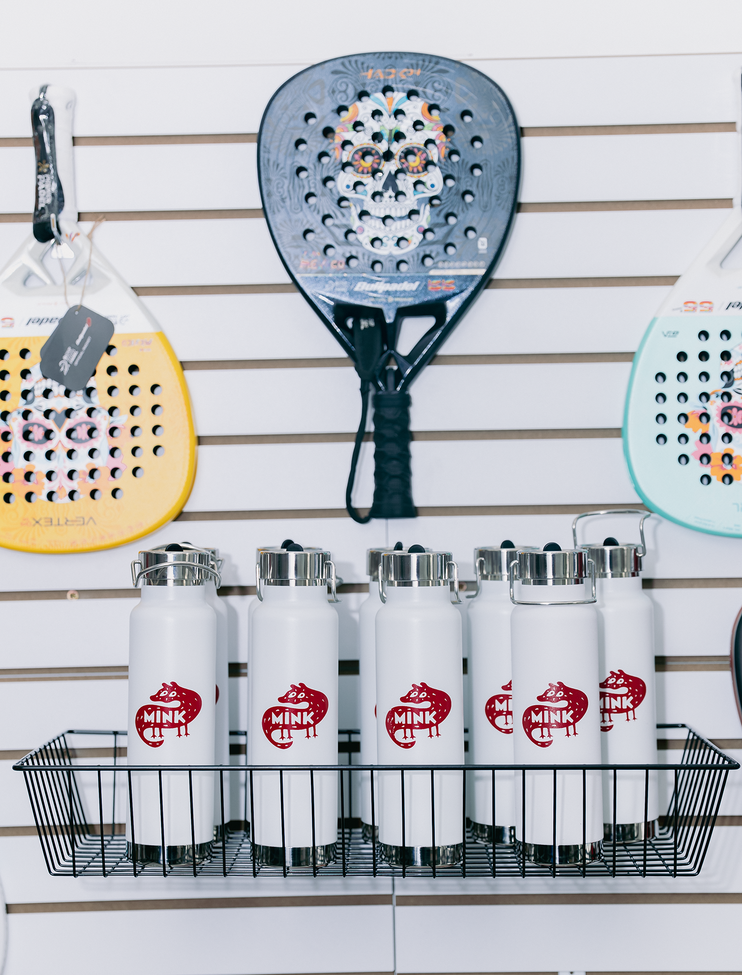
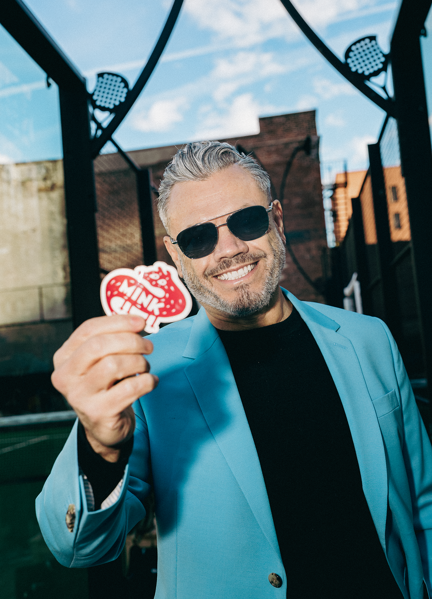
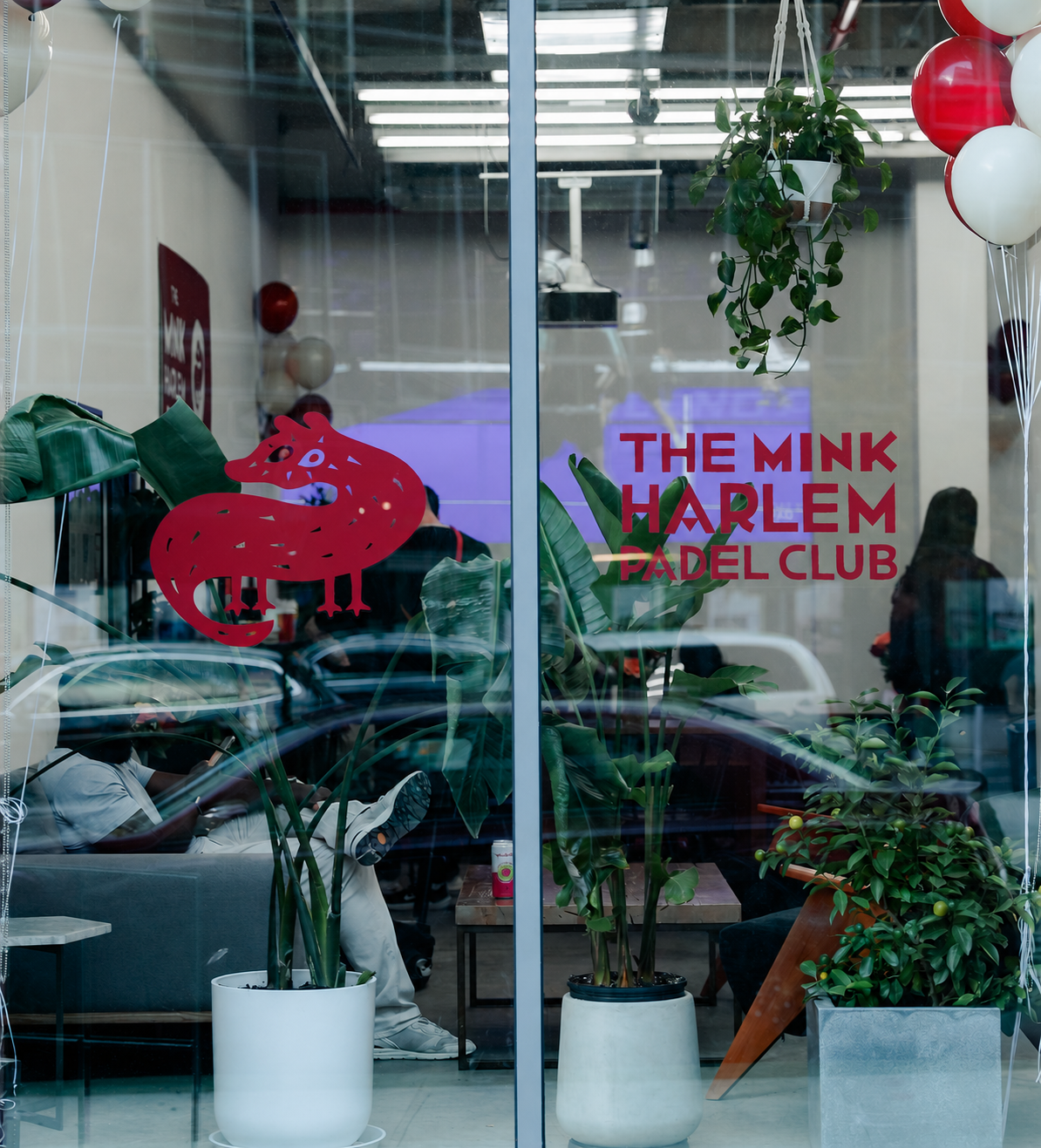
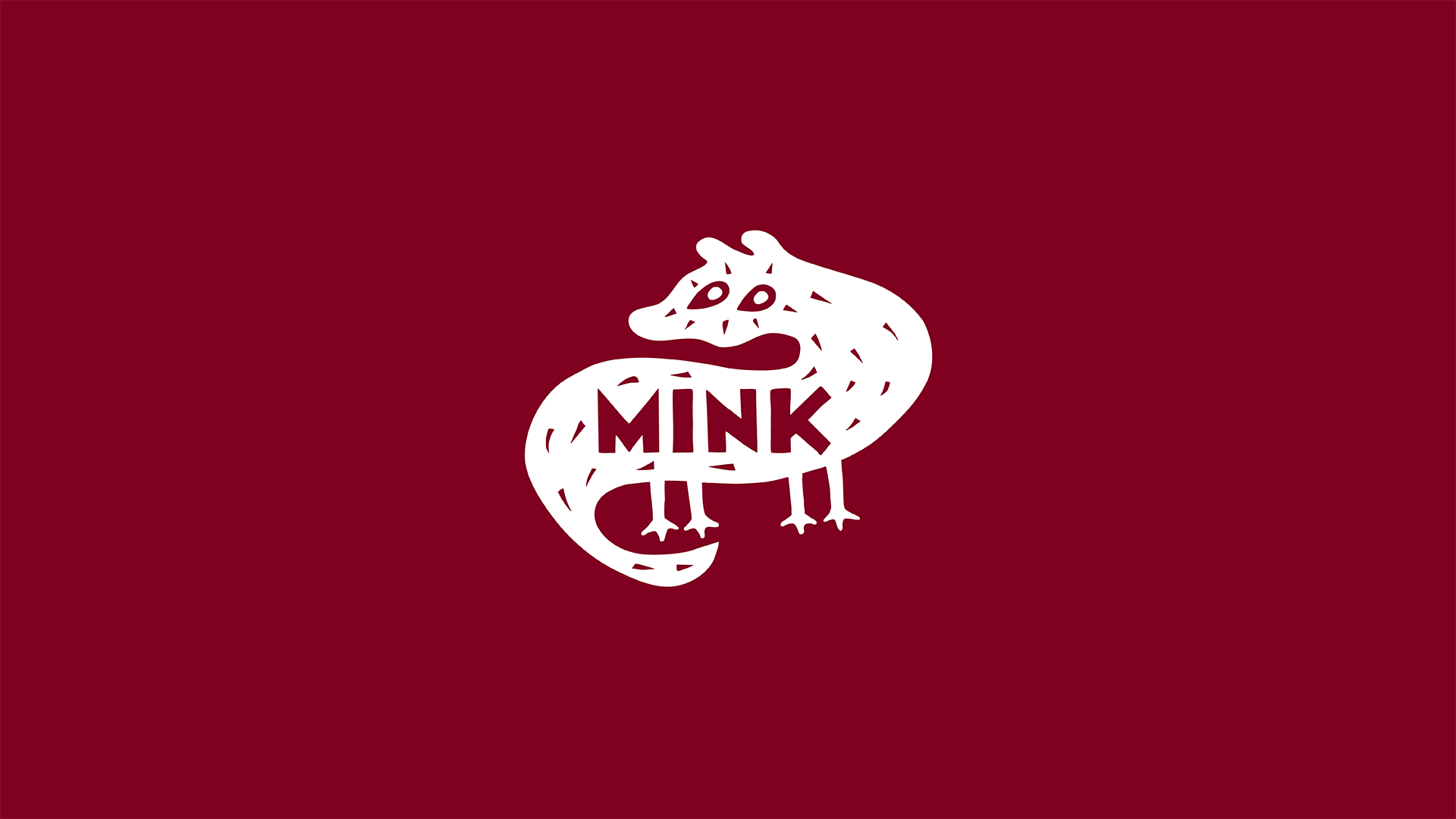
The final direction centered on an illustrated mink character inspired by the name of the building and the visual energy of street art. Designed to be charming, bold, and instantly recognizable, the mink gives the club a symbol with attitude and warmth.
To deepen the connection to place, Alfalfa Studio designed a custom display typeface inspired by the graphic language of the Harlem Renaissance. The letterforms bring rhythm, confidence, and cultural presence to the brand, while a clean secondary typeface keeps everyday communication clear and approachable.
The color palette is anchored by Mink Red, a rich and energetic tone that gives the identity strength and immediate recognition. Supporting colors add warmth and depth, while always keeping the system focused and cohesive.
Together, the mink symbol, custom typography, color palette, and graphic applications create a brand that feels both contemporary and rooted — a club identity built for sport, community, and Harlem pride.
ChallengesThe Mink was not just a sports logo. It was the identity for a new kind of club.
The brand had to balance several qualities at once: athletic and social, expressive and clear, elevated and accessible, neighborhood-rooted and open to everyone. It also needed to stand apart from the visual language of traditional racquet clubs, which often leans exclusive, polished, and predictable.
Instead, The Mink needed to feel alive. It had to welcome people in, carry the spirit of West Harlem, and give the club a strong personality before people ever stepped onto the court.
OutcomeThe Mink Harlem Padel Club launched in November 2025 and now uses the identity across its public-facing brand presence.
The visual system helped establish the club as a fresh, recognizable, and distinctly Harlem destination. The mink mark, custom typography, and bold color palette give the brand an immediate point of view, while the broader system supports social media, launch communications, apparel, photography, and everyday brand applications.
The result is an identity that makes a new sport feel local, accessible, and full of character — a brand built not only to attract players, but to create a sense of belonging.
Beyond the ResultsThe Mink Harlem Padel Club shows how design can help a new business become part of a neighborhood conversation.
By connecting modern sport with Harlem’s cultural heritage, the identity gives the club more than a look. It gives it a voice, a personality, and a public presence. The brand helps turn a recreational space into a community-facing destination — one that invites people to play, gather, and feel that they belong.