NBA’s Houston Rockets
What we did
Creative strategy
Identity design
Logo design and branding
The creation of “the most innovative and popular identity the NBA has seen in years”
-
Project Brief
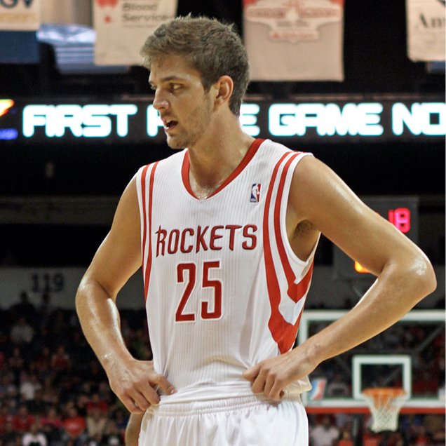
For many years in the National Basketball Association, the Houston Rockets were the team that rarely enjoyed the spotlight. But in 2003 that all changed: the 7’5” rookie Yao Ming was emerging as a wildly popular superstar on the court. A beautiful new arena in downtown Houston drew more fans and showcased the rising fortunes of the team and, like Cinderella finally going to the ball, the Rockets were re-dressed in enviable fashion. Sleek new uniforms and a matching logo were introduced to signal the arrival of the now formidable Rockets.
The Goal
When the owners of the Rockets made the decision to commission the new uniforms and logo, they wanted a look that would be revolutionary—something that would set a new standard in professional sports design. So they searched for a designer from outside the traditional sports graphic branding houses. In the end they hired a pair: Eiko Ishioka, who is best known in the United States as the Academy Award winner for her costume designs in Bram Stoker’s Dracula; and Rafael Esquer, an award-winning graphic designer in New York. The Rockets project would be the third creative collaboration between Ishioka and Esquer. Together, they brought fresh perspectives and broad creative experience to the task of challenging the traditional looks that reigned in the world of professional basketball.
Methodology
Working tirelessly for six months, Ishioka and Esquer explored a variety of creative angles that ranged from the specific history of the team’s name to the general context of the Space Age, rocket travel, and aerodynamics. They sought to graphically evoke abstract elements such as speed, precision, energy, propulsion, ascent, competitiveness, conquest, and victory. After experimenting with hundreds of graphic possibilities for the logo and uniforms, they made their initial presentation to the owners in Houston: twelve graphic directions for the logo and more than 20 uniform designs. From this set, five pairs of graphics and uniforms were chosen for further development.
Challenges
The main challenge was to create a brand identity and uniforms that would be immediately loved and embraced by prospect and existing fans, stockholders, marketing teams, the media, and even the players themselves. The logo had to be both exciting and highly commercial.
Conceptually Alfalfa Studio aimed to design a look and feel that would be innovative and memorable. Given the trust the team granted upon us, we knew we had a unique opportunity to propose a fresh design that would set the Rockets apart from the rest of the NBA teams.
“I think you guys have the most unique logo in the league. As soon as I saw the jerseys I was amazed. They were the hottest jerseys I’ve ever seen. As soon as it hits the markets I’m getting me a Stevie Franchise jersey. I would like to say once again to the whole Houston Rockets organization that you have done an extraordinary job.”
—Lionel McPherson, Brooklyn, NY
Pragmatically, the main challenge of this project was to create a brand that would be recognizable and easy to reproduce across a very wide scale, from ticket stubs to billboards. In addition, since the logo would appear ubiquitously during game broadcasts, simultaneous variable distance reading clarity on TV was a crucial factor.
Merchandise sales are a huge income stream for the individual teams and the NBA, hence logo applications had to be highly marketable. The fans disliked the current Rockets branding so much that some NBA stores didn’t even bother carrying their merchandise. This was a huge missed income opportunity, and one that needed to be solved by the rebranding.
Results
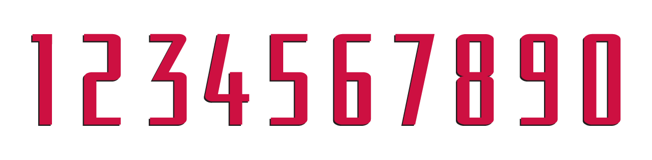
In the end, the winning design for the Rockets marries the energy of basketball with the legacy of the team’s name. The logo is a sleek icon, capturing the thrust and thrill of a rocket’s lift-off and bringing it into the context of the court. Because the futuristic uniforms and the logo were designed in tandem, the complete look is organic and fluid. Even the new typeface is custom-designed, in synch with the style of the logo. The letterforms and numbers on the player’s jerseys and shorts were precisely drawn so that every single digit can be read well from a distance, whether by a fan in the arena or by one watching the game on television.
The Rockets have a very committed and vocal fan base, who went crazy over the new logo and uniforms. A few comments from their website:
“I must commend the whole organization for an outstanding job on the whole design of the logo, uniforms, colors and finally an amazing arena in which other teams will once again fear CLUTCH CITY.”
—Antone Hackney, Dickinson, TX
“I really, really like the jerseys. They have great colors and a fresh style. “
—Adrian Ramon, Harlingen, Texas
“From what I have seen so far, (the uniforms) look great. Much better than the gaudy space ones of the last few years. Whoever designed them did a good job at creating freshly styled lines as well as putting them in prime places, being the bottom of the shorts and around the arms. Plus, I think the intention of making them stylish but timeless was done successfully. They are simple but cool. Can’t wait to see them on the players.”
—Andy Ingram, Seattle, WA
“I wanted to be one of the first to say, I LOVE the new uniforms. The designers did an outstanding job. The color scheme has a nice touch reminiscing the old 94-95 colors but with a modern twist. They aren’t too flashy nor too boring, and I feel the new Rockets logo was put in the right place.”
—Charles Jolivet, Houston, TX
Beyond The Results
While other marks in professional basketball are often cartoony and overly illustrative, the Rockets new identity succeeds in departing from these expected styles in mainstream sport graphics. It is simple, classic, energetic, and forward thinking. Yet the logo is also extremely practical and versatile from a marketing point of view, easily adaptable for use on merchandise and billboards, in broadcast and signage, and on ticket stubs and T-shirts. In this way, Ishioka and Esquer have met the expectations of the Rockets’ owners for a new standard in sports design.
“Designers Ishioka and Esquer organic and collaborative design process has produced the most innovative and popular identity the NBA has seen in years.”
—Julius Wiedemann, Editor, Taschen
In only couple of seasons after launching the new logo, arena, and uniforms the Houston Rockets ranked #3 as the most valuable team in the NBA with a revenue of $141 M for the 2004-05 season. Since premiering the new look and feel, the Rockets have remained among the ten most valuable teams in the NBA.

See more Brand Development